Uniq type
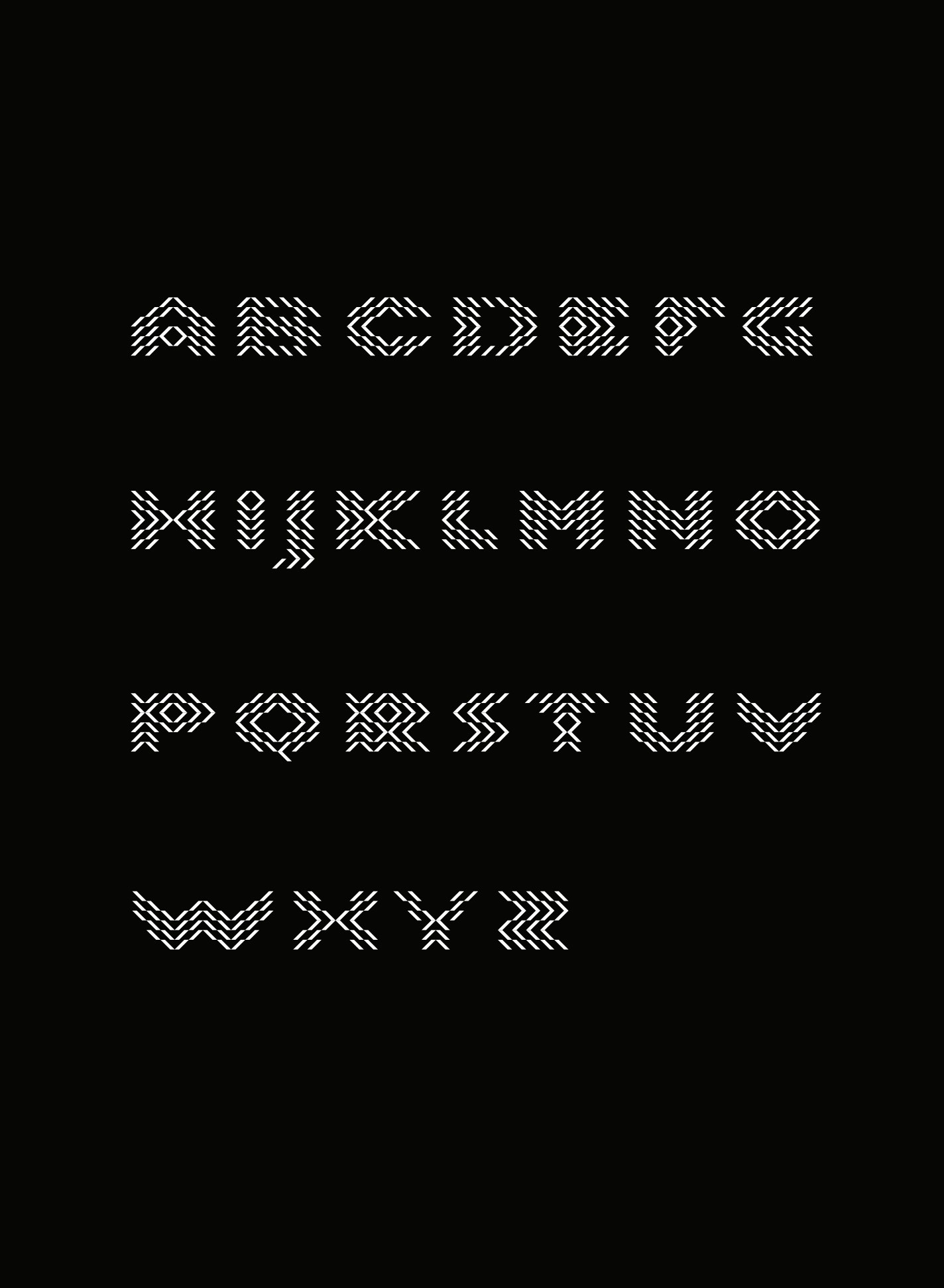
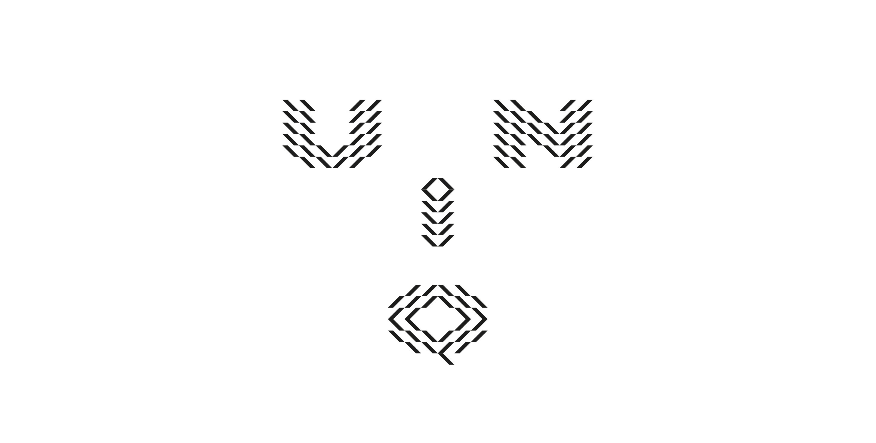
Design Principles and Structure The defining feature of this typeface family is the fusion of a monochrome, hatched (line-group based) texture and a strict geometric skeleton. Instead of being constructed from continuous lines, the characters take shape through the condensation and refraction of diagonally running, rhythmic line systems. This approach creates a vibrant, kinetic optical illusion (op-art effect) that gives a sense of motion to static forms. Each letter stands on its own as an independent, abstract pattern, while the rigid right-angled and diagonal system provides a cohesive, high-tech, and industrial character to the entire alphabet. Due to the nature of the typeface, it functions primarily as a display and headline font.
Services
Typography
Client
Privat
Design
Kiss Zsombor
Year
2020